Amiral Cruises Logo Meaning:
Amiral Cruises: Saigon River, Vietnam – A Voyage Through Time on the Saigon River
Overview:
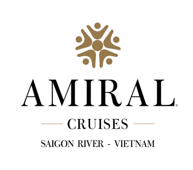
The Amiral Cruises logo encapsulates the historical richness and luxury of the Saigon River experience through its elegant and simple design. It features a primary color palette of golden hues representing luxury, with accents of ocean blue and white to evoke the serene and majestic qualities of the river.
Symbol Details:
Amiral: Named after the Amiral Latouche Tréville, the ship on which Nguyen Tat Thanh (later President Ho Chi Minh) worked before his significant journey from Nha Rong Wharf in 1911. The term “Amiral,” reflecting the rank of Admiral, suggests leadership and authority, enhancing the brand’s identity.
Prominent Text: ‘Amiral’ is centrally placed and bold, making it the focal point of the logo, whereas ‘Cruises’ is situated below to maintain visual harmony.
Iconic Symbol:
Central Figure: A stylized sun, perhaps doubling as a compass, signifies guidance and the expansive journey of discovery. This central motif can also be interpreted as a representation of a great leader, symbolizing inspiration and leadership.
Five Human Figures: Symbolizing people from all five continents, these figures represent global unity and the five virtues of kindness, virtue, wisdom, uprightness, and faithfulness. This concept also nods to the five essential spices and colors in Vietnamese culinary arts and the five senses.
Color Scheme:
Golden Hue: Conveys luxury, prestige, and high quality, reflecting the premium cruise experience.
Black symbolizes elegance and sophistication, often chosen for its sleek, powerful aesthetic in luxury and high-end cruises, where it enhances the sense of exclusivity and mystery. We bring the story of Amiral Cruises to life.
Blue Ocean Background: Symbolizes the vast and majestic nature of the oceans, drawing inspiration from Nguyen Tat Thanh’s patriotic journey.
White: Represents water, purity, simplicity, and safety, and is also symbolic of the seamless blending of sky, earth, sun, and moon—a nod to Feng Shui principles promoting continuous development.
Design Elements:
Balance and Symmetry: Achieved through a careful arrangement of the logo’s components, ensuring it attracts and retains viewer interest.
Minimalistic and Elegant: The design is both easy to recognize and adaptable to various media, ensuring broad applicability.
Feng Shui Influence: The logo incorporates indigenous philosophy with a modern and global appeal.
Slogan “For Presidents”:
Brand Promise: Indicates a commitment to providing the highest level of luxury and service, aimed at presidents and discerning luxury travelers.
Professional Design:
Crafted Standards: The logo adheres to high identity standards to ensure brand strength and recognition across platforms.
Attributes: The design is minimalistic, streamlined, friendly, and meaningful, with an elegant typeface that is flexible and suitable for diverse applications.
Registration: The logo is protected by the National Office of Intellectual Property of Vietnam.
Keynotes:
Strong Brand Identity: Serves as a significant concept in the minds of customers, setting a high market differentiation.
Marketing and
Communication: Enhances customer retention, talent acquisition, and a robust corporate culture.
Financial Performance: Strong brands typically demonstrate superior financial performance and are more attractive to investors.
Valuable Asset: The brand stands as a valuable intangible asset, bolstering the business value and posing a strategic consideration for competitors.
This refined and historically rich logo promises an unforgettable luxury experience on the Saigon River, blending modern elegance with deep cultural roots.


